Line Charts
Last updated: October 29, 2024
The configuration of a line chart does change significantly from Bar Chart. Visually - each row type that’s selected will display its own individual line. Here is the same data found in the bar chart documentation formatted as a line chart.
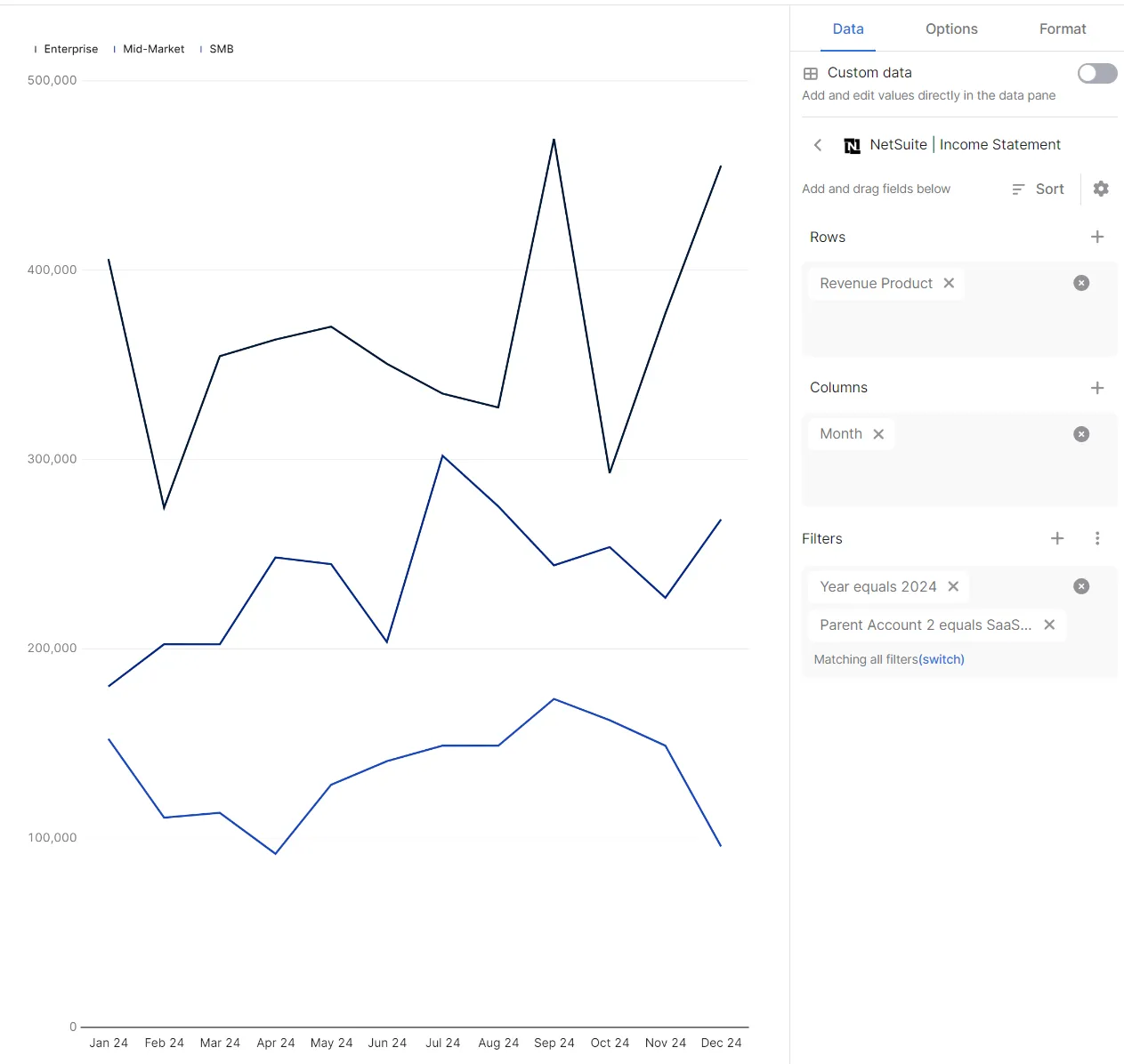
By going into "Options" located in the top right of the customization pane, we can start changing how this data is displayed.
Options:
Row Options: You can opt to invert a sign (e.g. you might want to show expenses as negatives even though they come through as positive values from your ERP) or use a different axis if you’re mixing numbers in different scales (Product Revenue vs Unit Sales).
In the “Format” pane you can configure both axes, how data is formatted, and what labels to display.
Format:
Y-Axis: The title will display a title on the left side of the graph. The format allows for some pre-created formats to display values on the left (or right for a secondary axis), with the ability to use Excel’s custom-format if required. The range will control both the bottom and top-most values of the axis.
X-Axis: The title will display a title on the bottom of the graph. Label grouping allows you to choose between showing the full name of each tick-mark, whether it gets shortened with ellipses, or hidden based on its length. The format will generally fill itself between either a Number or Date, depending on what was chosen for the axis.
Labels: A “Series Label” will show the name of each series at its final point.
Tooltip: When hovering over the graph to show data, the format selected is what will be displayed. I.E, $200,000 will show as $0.2M for “Accounting Millions” and $200K for “Accounting Thousands”.