Blocks
Last updated: November 6, 2024
Blocks are the way we organize, query, and visualize the information that’s housed within Aleph within a Dashboard. Each Block type has a unique feature-set and way of interacting with information. Data can be selected from your existing Tables or through Custom Data (hyperlink).
There are 6 types of Blocks that can be used, each with their own type of visualization or method of displaying information:
What’s in a Block?
Each time you create a new Block, you’ll be met with a variety of areas to adjust:
Name and Description: Found in the top left section and accessed by clicking on the drop-down. The name and description will always appear on your dashboard for a given Block.
Block Type: For new Blocks, the default is the "Bar" chart option. This can be changed using the drop-down menu found in the top right.
Data: This is the content that powers the Block. Just like with the Aleph add-ins, Data can be brought into a Block using an 📄 Explore.
Custom Data Pane: Found in the bottom as a collapsible blue “Show data” icon, this replicates spreadsheet functionality and gives you a workspace to build out Blocks using custom data. The custom data can include values generated with an Aleph function, hardcoded values, or manual overrides of Explore-generated data
Options and Format: These dynamically change based on the visualization selected, but generally work to select the data you’d like displayed, edit how that data will be shown, adjust colors used in the visualization, and add labels and formatting to the axes and series.
Adding a New Block:
Enable "Edit" by selecting the blue pencil icon in the top right of the dashboard.
Select the “Add block” icon
If you have been interacting with other elements (Blocks, title, description, etc.) you will be prompted to discard or save any changes you’ve made. Regardless of your selection, you will proceed to the “New block” screen.
You may now rename your Block, adjust the Block type, select the data you’d like to use, and format the Block as needed.
Once you’ve made the changes you’d like, remember to hit the blue “Save block” icon found in the top right.
Each Block type has its own article to provide more detail:
Data
Data is queried in a similar fashion to the add-in. This is only available for Bar, Line, and Table formatted Blocks. For other Block types that contain data (Waterfall and KPI Blocks), this data would be generated via the Aleph function and custom data.
The general steps for selecting data are as follows:
Select the table you want to use as your underlying source.
Select the Rows you want to display (by default this will be the Y-axis). Multiple dimensions can be chosen for the row. For instance, you can choose both Entity and Product to show the breakdown of Product Sales across multiple products for each individual entity.
Select the Columns that you want to display (by default this will be the X-axis).
Filter the data as needed. Note: Leaving data unfiltered will allow for the global filters to work more easily. As an example, filtering the scenario to “Budget” for operational expense data will only ever show “Budget” information. If you were to have a Dashboard Filter against the “Forecast” scenario, this Block would not show any data.
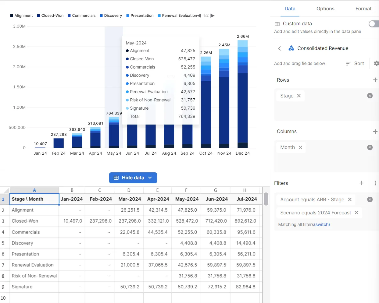
Tip: You can always open the "Show Data" pane to see how your data is coming through in a table format.
For example, here is a bar graph that displays the monthly ARR across different sales stages.
Custom Data
Custom data allows users to create charts in a spreadsheet-like environment. This functionality allows users to employ spreadsheet formulas like SUM(), SUMIFS(), or XLOOKUP() alongside the Aleph Function to pull data and reference variables.
Custom data within a Block gives you the ability to query data from multiple tables to populate the same Block, perform custom calculations, reference variables, and/or choose how that information will be displayed. In order to begin using custom data, it must be activated using the “Custom data” toggle located in the top right of the Block options in the "Data" section. It should be noted that Filters will not apply to any Aleph Functions that are used. Instead, you should use📄 Variablesto create more dynamic formulas.
Once activated, you can interact with custom data in 3 ways:
Excel File: Uploading custom formatted Excel files allows you to use your previously created Workbooks as a basis for visualizations.
Level of Detail: Choosing the number of header rows and columns (only available for Bar/Line/Waterfall Blocks).
Workbook: Allows you to work in an Excel-like environment to query, input, arrange, and run custom calculations on data
Understanding the Custom Data Pane
At the bottom of each Block with “Custom data” enabled, there’s a “Show data” button that can be toggled to expand the spreadsheet that will house all of the information required for each Block. The Custom Data Pane works like an Aleph Workbook, and allows users build Excel or Google Sheets-style spreadsheets that are linked to the Block.
To better showcase how the Custom Data pane is used, we’ll start with two simple use-cases: displaying Total Product sales for Product A across two months and showing Product Sales for Product A and Product B in a single month.
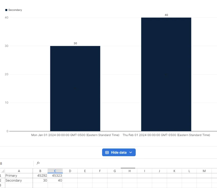
Example 1: Typing Jan 1 and Feb 1 into cells B1 and C1 respectively will begin to use those two months as dates, allowing for time-series displays. Any number entered below Row 1 in these columns will be displayed accordingly. We’ll enter the number of Product Sales for product A in those cells.
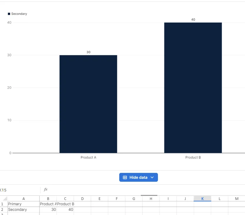
Example 2: Entering “Product A” and “Product B” into cell B1 and C1 will use those two names as the X-axis. Any number entered below Row 1 will be displayed accordingly, allowing us to compare two different product categories side by side.
For a more complex interaction, let’s combine the two examples above.
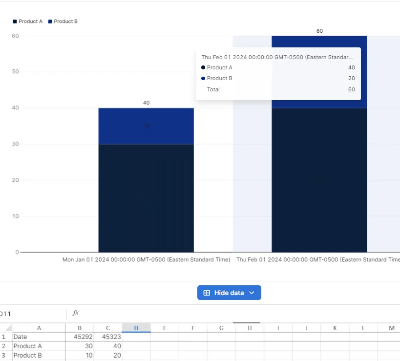
Example 3: What if we wanted to see our different products and their respective unit sales across time? By adding additional rows, you can create multiple categories within each row and column that will be reflected in the visualization. In this case, we’re keeping the Date as the X-Axis, but will rename Row 2 (cell A2) to “Product A” and add “Product B” to Row 3 (cell A3). Once we’ve entered some data within the table, we can now use our different Block types to show this information. A bar graph works for us here as the overall bar reflects "Total Sales".
In the examples above, we’ve hardcoded those numbers, but what if we wanted to pull information from our product-sales Aleph table? We can use the📄 Aleph Functionto do this. Similar to how the function operates within Excel and Google Sheets, we can use it reference pull data within the Workbook itself.

We’re using cell B1 (Date) to pull in the Product Sales data for the month of January, and cell A2 (Product Type) to filter that data against the specific product. By anchoring the rows and columns to Product and Date, we can drag this formula as needed to query data across multiple dates and products.
Since each cell can contain a customizable Aleph Function, Formula, or Direct Input, you have incredible flexibility in your ability to display and compare information across different systems, tables, entities, departments, and more.
Each type of Block will have its own way of working with custom data - but the underlying functionality of the workbook will remain the same.