Waterfall Charts
Last updated: October 29, 2024
A waterfall chart can be used to depict the change in values between a beginning and ending point. You can use it to show the make-up of revenues and expenses over the year to a final net income, or to show how headcount may have changed by displaying the beginning value, new hires, transfers, departures, etc. Additionally, this can be used to show variances in each area between scenarios. All waterfall charts use custom data, ensuring additional flexibility and the ability to reference Variables.
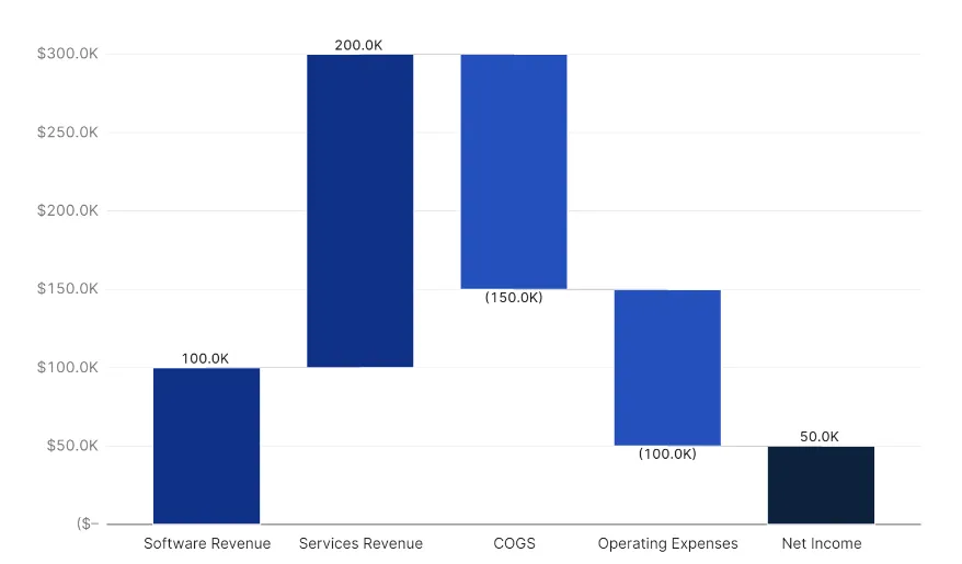
A waterfall block will include three areas, with the majority of configuration resting within the Workbook.
The Custom Data Pane
By default, only one header row and column will exist, but generally this is sufficient for most waterfall charts. This means that the column A will be used for labeling and organizational purposes and will not display any values or text that appear on the chart.
Each column to the right of the header column will determine the name of a data point that will appear on the x-axis and its value. Using the example above, this is what the data pane looks like:
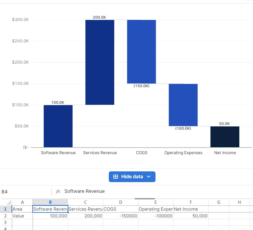
In this example, we have 5 different column headers, each designating a major part of a P&L. The values located in Row 2 can be retrieved using an Aleph Function, calculated using formulas, or populated manually. In this case, Net Income is calculated as a formula, while the other values are retrieved from our Tables.
Adding one or more rows will create partitions within each bar as seen in the following example.
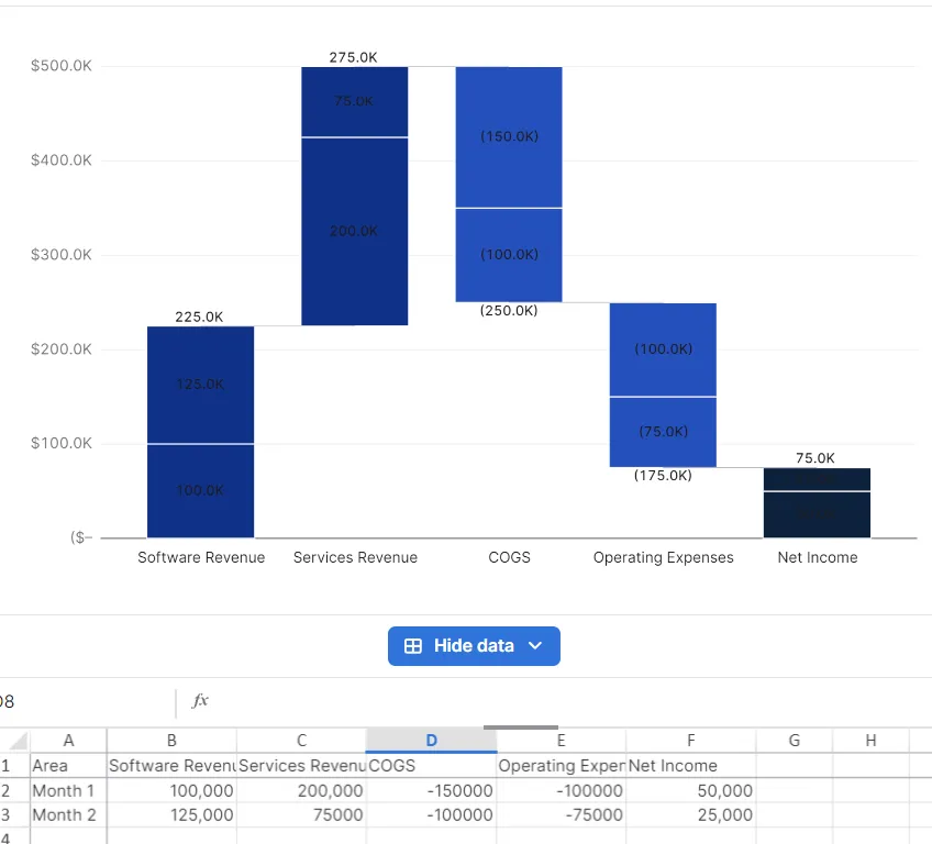
As an example, we can continue down this path and create 12 rows, one for each month of the year. We can also use Aleph functions to reference those rows directly in our formulas, allowing us to create waterfall charts that are dynamic and can change depending on our variables.
Note: Values don’t have to be negative, they can be inverted column by column in the “Options” tab.
Column Options
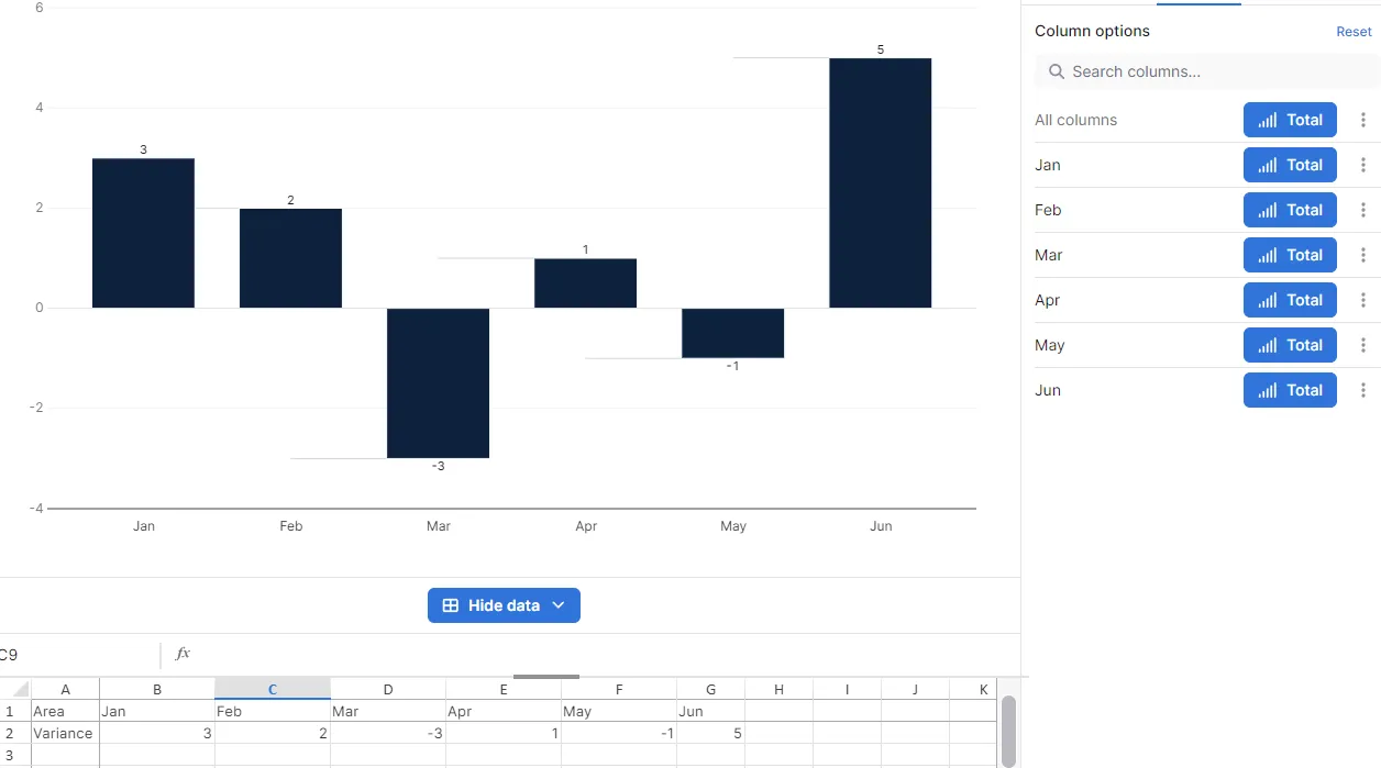
The "Options" section controls how the values are displayed. Each column will have two main options: whether it’s displayed as a total and if the sign needs to be flipped. Displaying a value as a “Total” will have its starting point begin on the x-axis, going up to its end point for positive values, or down for negative ones. Conversely, columns that are not selected as a “Total” will have the starting point at their value, going up the y-axis for their positive amount, or down for a negative amount.
Here’s a simple example to better illustrate this concept.
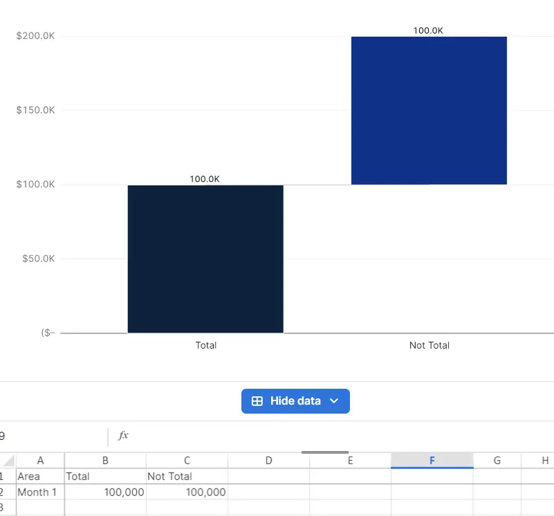
In this case, “Total” shows what the Total option would look like if selected. As noted, the “Total” column begins at 0 and goes up until it reaches its intended value, while the “Not Total” value begins at its intended value and goes up by that same amount.
The following example uses the same values, but the signs are inverted.
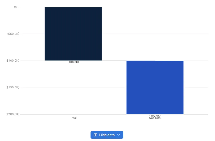
Here’s a simple rule to follow: If you want to display a breakdown of how one final value is calculated, you should place that final value in the last column, and should only use the “Total” setting for the ending value. If the values in the columns you want to display are independent of each other, then you can use “Total” setting for every column.
Following that rule, here’s an example of a Final Value calculation using Headcount.
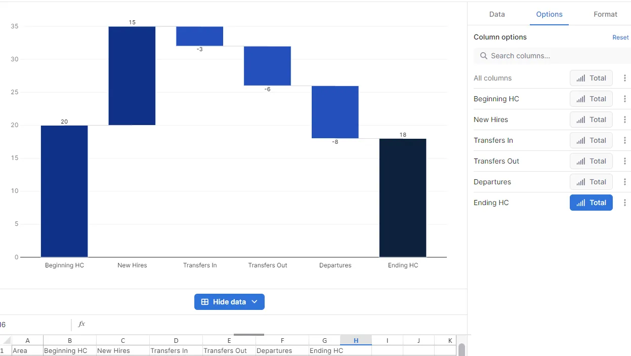
If instead of a final value, we wanted to show the variance of headcount for each month from Actual to Budget, we would be better served with the following options.
Since we’re not calculating any final value, this visualization of the data is much easier to understand.